Sokken-online.nl strengthens its online presence with a new brand identity
Branding, Corporate Identity, Logo, Online, Strategy

From vision to visual identity
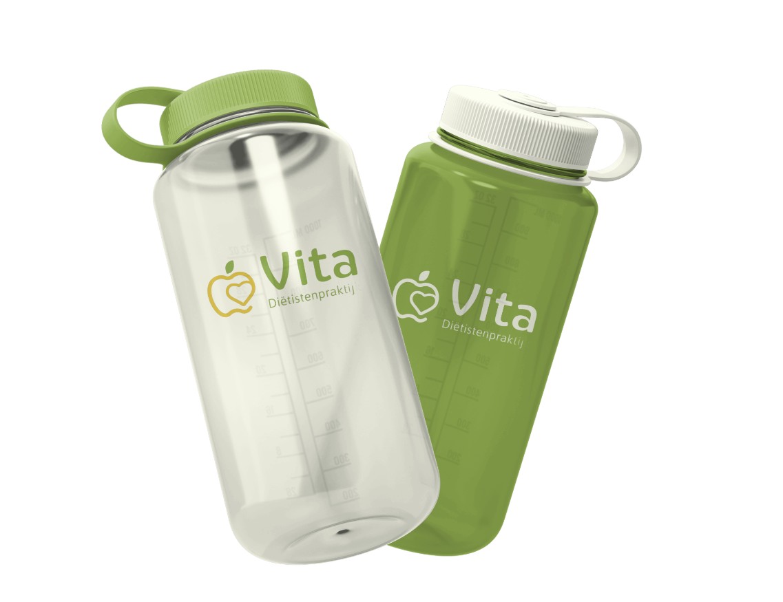
For Dietitian Practice VITA, we developed a completely new logo and a distinctive brand identity that reflects their personal approach and vision on health and nutrition. Ingrid van Bommel, founder of the practice, wanted a visual identity that conveys calmness, trust and professionalism, without feeling distant. With that clear direction, we got to work.
Industry
Healthcare
Services
Brand Identity Design, Logo Design
Timeline
1 month

The new logo reflects exactly what Dietitian Practice VITA stands for: balance, simplicity and health. The typography is clean yet approachable, while the shapes and colours have been carefully selected to feel soft, natural and accessible. Not a standard healthcare logo, but a fresh visual identity with character and distinction.
In addition to the logo, we developed a complete brand identity, including a defined colour palette, typography guidelines and consistent application across print and digital media. This includes business cards, letterheads and social media templates, all designed in one cohesive style to ensure VITA is instantly recognisable across every channel. The new visual identity seamlessly supports the practice’s mission: providing personalised nutrition guidance in a safe and supportive environment.